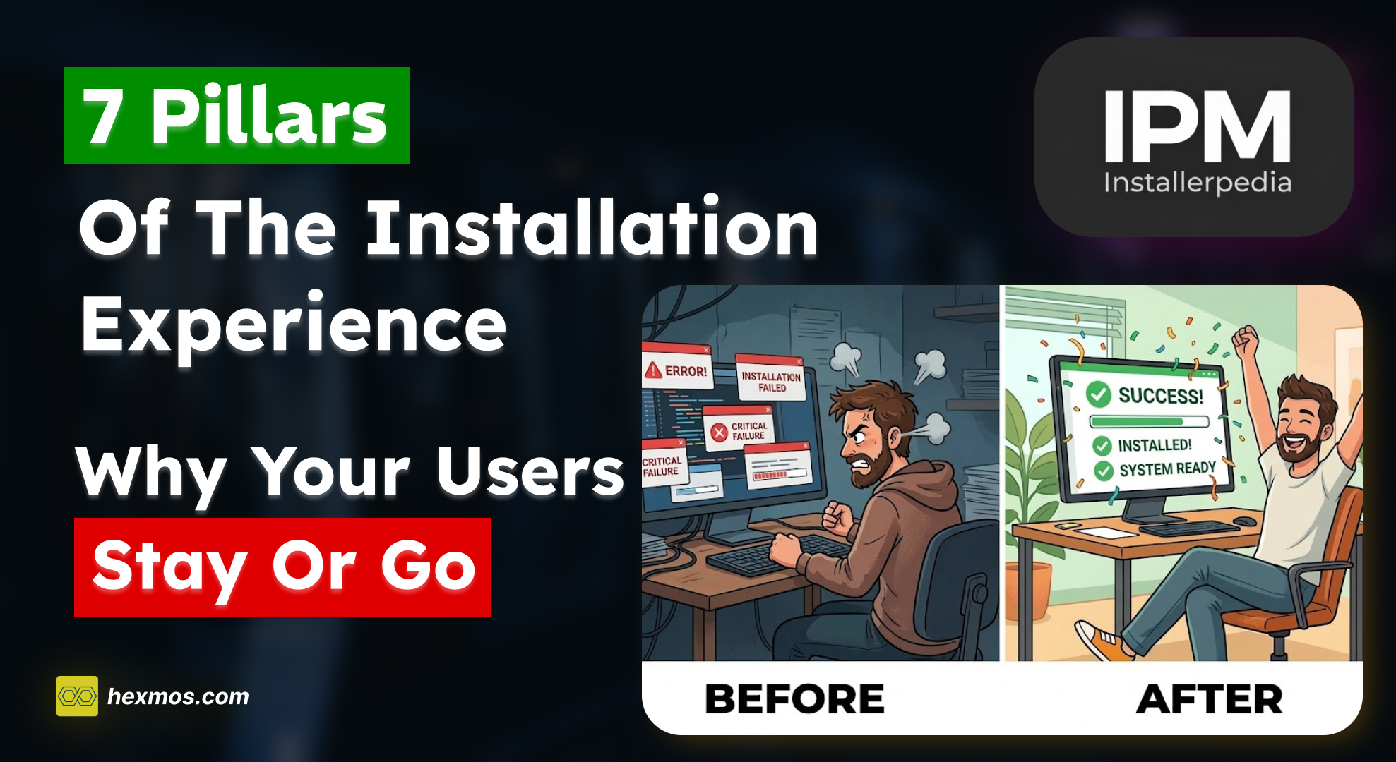
Is Your Sidebar Hurting Your UX? Our Redesign Journey to Effortless Navigation


Have you ever felt frustrated navigating a website with a clunky sidebar? We hear you. At Hexmos, we're constantly striving to improve the user experience.
Recently, we took a critical look at our sidebar design and identified many areas for improvement.
This blog post will delve into the journey of redesigning our sidebar navigation, taking inspiration from industry leaders.
Our Existing Sidebar Design
High Contrast and Visual Distraction
Our initial sidebar design boasted a bold black-and-white theme.
While visually striking, it created a high visual contrast that drew unnecessary attention away from the content users came for.
This distracted from the overall user experience.
Solving issues in the initial design
We recognized the need for improvement with our initial sidebar design.
Prioritized user focus on the content by implementing a lighter theme for the sidebar and navigation bar.

This shift in color scheme achieved two key goals:
Reduced Visual Clutter: The lighter theme created a more balanced visual experience. The sidebar no longer competed with the main content area for user attention.
Content Takes Center Stage: By adopting a lighter theme, the content on the page became the focal point. Users could now easily find the information they sought without being distracted by the sidebar.
However, the User experience was not good due to multiple issues.
Inefficient Multi-level Navigation
While the lighter theme addressed the initial contrast issue, further exploration revealed a new challenge.
Our multi-level navigation structure requires users to click through three levels to reach certain sections.
This inefficiency became apparent as users expressed frustration with the navigation flow. Imagine trying to find a specific setting buried within three layers of menus!
A solution was needed.
A three-click journey wasn't ideal. We brainstormed solutions to improve the navigation flow and user experience.
Our goal was to create a system that was both intuitive and efficient, allowing users to find what they needed quickly and effortlessly.
Before going into the solution let's understand the product we are building.
Hexmos Feedback
We are a small team, building a product called Hexmos Feedback.
Feedback Consistently Motivate Your Team with Less Effort.
More than 60% of employees yearn for regular, meaningful feedback, but often feel undervalued.
Hexmos Feedback helps your people provide frequent feedback to one another effortlessly
so that your team always remains highly motivated.
Feedback keeps teams motivated and engaged through recognition and continuous feedback.
We have attendance management as a part of Hexmos Feedback. We go beyond simple attendance. We help you look at "participation".
Explore Feedback: https://hexmos.com/feedback
Our book: https://turnoverbook.com/
Case Studies
To find inspiration for a more intuitive navigation system, we turned to industry leaders known for their user-friendly interfaces. Here's what we learned:
Notion
Notion offered a clean, single-level sidebar.
It has some issues which cannot be used in our use case.
Absence of multi-level navigation
While this worked for their specific content structure, it wouldn't accommodate our complex, multi-level navigation needs.
Single-Level Navigation Wasn't Enough
Having all the elements in the sidebar will clutter the sidebar, making it difficult for users to find what they're looking for.

What is our requirement?
Mainly we needed Hover-Based Navigation, Adaptability, and Enhanced Grouping.
So, we looked at another case study

Google Play Console
Unlike Notion, Google Play Console utilized a single-level navigation with additional functionalities accessed through tabs.
Lack of Visibility of navigation all at once
While this streamlined the experience for accessing some features, it could not display all navigation options at once.
This could be overwhelming for users with diverse needs and all the other navigation is done through tabs. All right, we can do tabs.
Switching with Tab
Imagine having to switch between multiple tabs just to see all the available options!
It is not that we can't do but showing everything present for the user directly when they hover would be more greater thing, Right? Then we came to what is that cloud?
That is why even the Google Play console didn't work.


Google Cloud
Our previous navigation system required users to click through multiple levels to reach their desired destination. This inefficiency created frustration as users felt lost in a maze of menus.
Why choose Google Cloud?
Google Cloud's navigation system addressed this problem with its hover-based interaction.
Users could simply hover over the sidebar elements to see all navigation options, eliminating the need for unnecessary clicks.
This intuitive approach made navigation quicker and easier.
Additionally, Google Cloud employed a clear visual hierarchy using differentiated text sizes and capitalization for primary, secondary, and tertiary navigation levels.
This hierarchy allowed users to scan the sidebar and identify the section they needed at a glance.
This focus on user-friendliness and efficiency is what made Google Cloud's design the perfect inspiration for our own redesign.


Final Implementation
Drawing on the strengths of Google Cloud's design, we implemented the following enhancements:
Hover-Based Navigation
Users can now explore all navigation options simply by hovering over the sidebar elements, eliminating unnecessary clicks and frustration.
This intuitive approach allows for a quicker understanding of the available functionalities.
Hierarchical Theming
We created a clear visual hierarchy using text size and weight. Primary navigation features bold and larger text, secondary elements are slightly smaller and capitalized, and tertiary options utilize a lighter hover highlight for differentiation.
This visual hierarchy makes it easy for users to scan the sidebar and identify the section they need at a glance.
L1 (Primary) Navigation:
Bold and larger text.
L2 (Secondary) Navigation:
Slightly smaller, capitalized for easy differentiation.
L3 (Tertiary) Navigation:
Smaller, lighter hover highlights to indicate hierarchy.

Minimal and Focused Design
We prioritized a clean and uncluttered design aesthetic, ensuring the sidebar doesn't compete with the main content area.
This minimalist approach prevents information overload and keeps the focus on the user's task.
Adaptability
Recognizing the diverse needs of users across different screen sizes, we incorporated a sidebar minimization feature for optimal viewing on smaller displays.
This ensures a seamless user experience regardless of the device being used.
Enhanced Grouping
We ensured related navigation items were grouped for better organization and discoverability.
Grouping similar functionalities makes it easier for users to find what they're looking for and understand the relationships between different features.
To understand even more about it You can refer to this Article
Conclusion
The redesigned navigation system, inspired by industry leaders and user feedback, is a significant step forward.
By prioritizing a user-centric approach, we've created a more intuitive and efficient navigation experience that empowers users to find what they need quickly and easily.
We believe this translates to a more enjoyable and productive user journey on our platform. This redesign is a testament to the importance of listening to user feedback and constantly iterating to improve the user experience.
We are confident that these changes will make our platform more user-friendly and accessible for everyone.

FeedZap: Read 2X Books This Year
FeedZap helps you consume your books through a healthy, snackable feed, so that you can read more with less time, effort and energy.