5 Critical Concepts: Creating Responsive and Cross-Browser-Compatible Websites


Responsiveness and Browser Compatibility Problem
A well-made website should be compatible with multiple screens and browsers. Two major problems that we encountered while building webpages are Screen Responsiveness and Browser compatibility.
Devices can come in a wide range of screen sizes and resolutions from small smartphones to large desktop monitors. Building and maintaining responsive design for all these screens is a challenging problem.

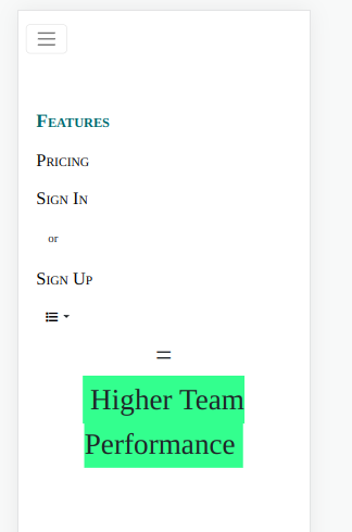
The navigation bar on Desktops
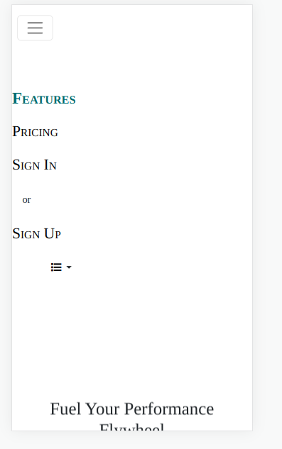
The navigation bar on Mobile screens
Browser compatibility is another major problem. Sometimes the website or web application doesn't display or function consistently across different web browsers. The problem is compounded due to CSS rendering differences, JavaScript compatibility, web fonts etc.
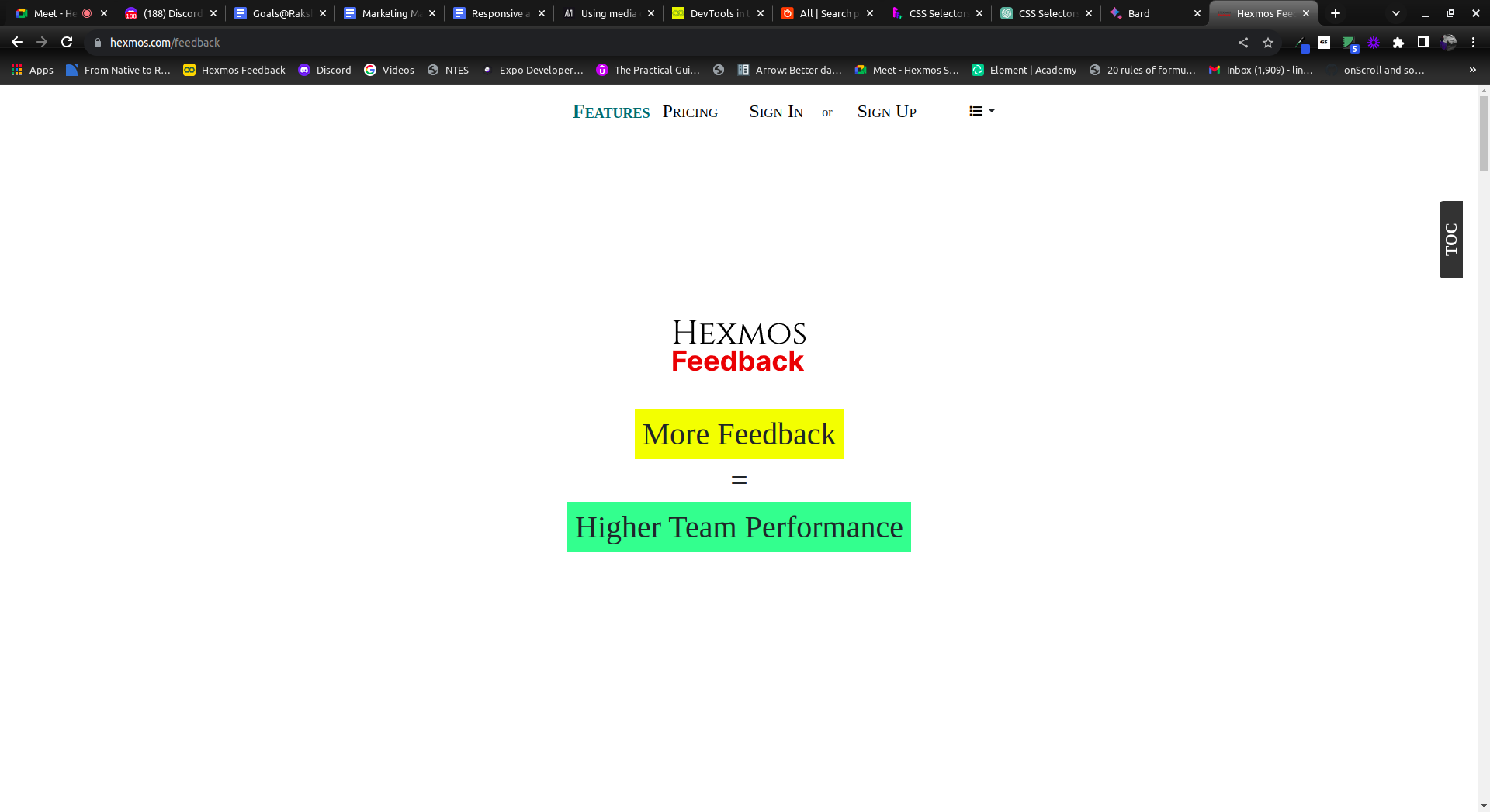
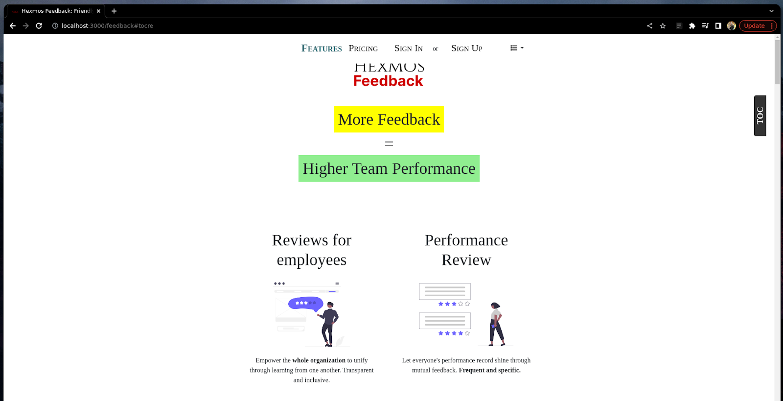
Our product landing page in Google Chrome
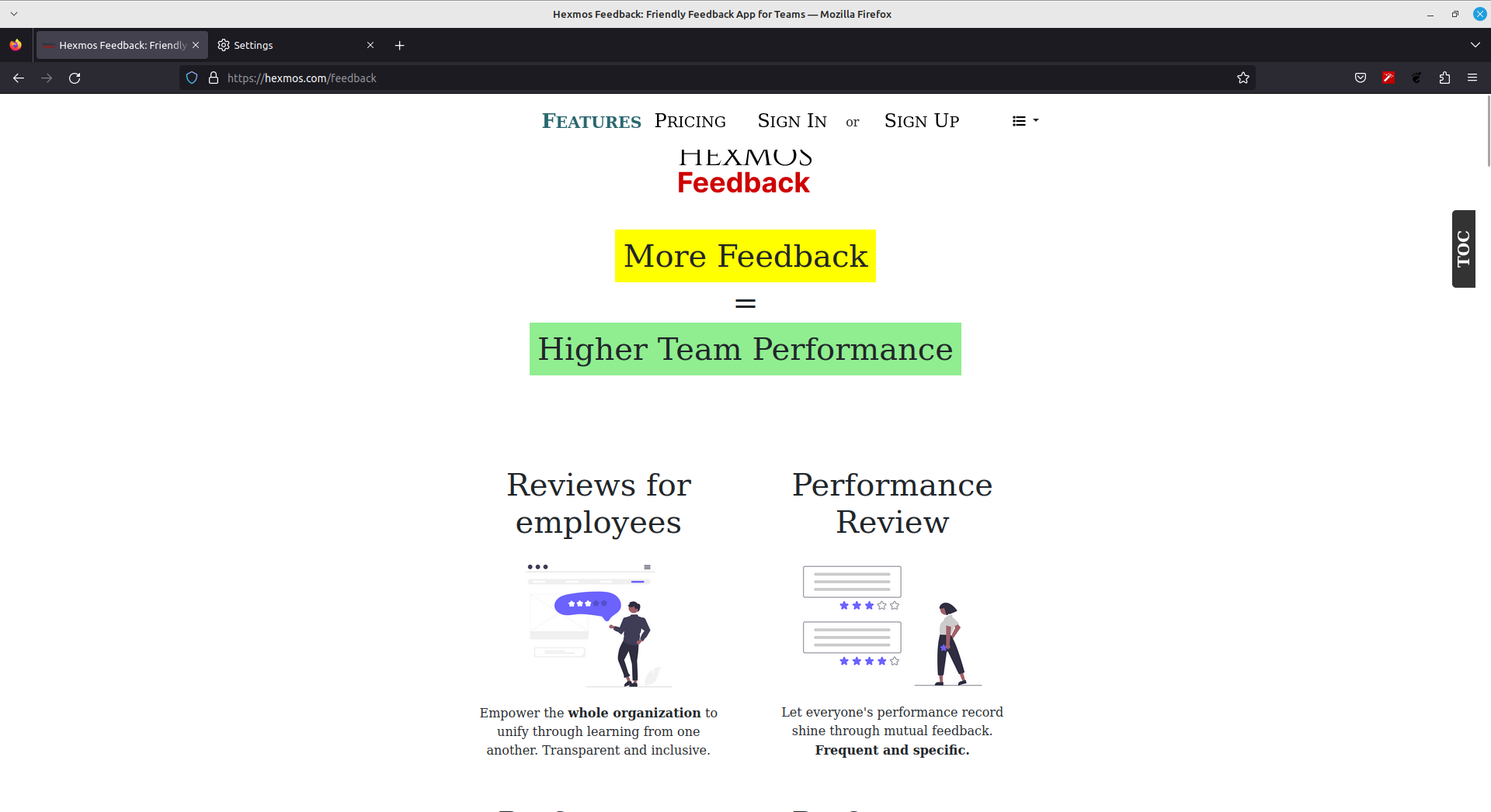
Our product landing page in the Firefox browser
The web page is compatible with Google Chrome but the alignment and spacing are not compatible with the Firefox browser. The logo and spaces are hidden under the navigation bar.
Solving Compatibility Issues
The major causes of responsiveness issues are due to:
- Incorrect Breakpoint Management
- Incorrect Box Alignment
We can use Media Queries to apply specific rules to include a block of CSS properties only if a certain condition is true. Media queries help to target specific screen sizes.
Layout, Alignment, and Spacing can be managed better using a one-dimensional layout method such as Flexbox. It simplifies complex layout challenges by providing a powerful way to create responsive designs and control the positioning of items within a container. Here we use the Bootstrap Flexbox utilities.
The major causes of browser compatibility issues are due to
- Font not being supported by the browser
- CSS properties not supported by the browser
We can use fonts compatible with all browsers, or include the font within the codebase.
Different browsers behave differently to certain CSS properties, so we have to cross-test frequently to ensure that a property behaves differently and apply the fix that is compatible with all browsers.
Let's discuss in detail how we solved the major Responsiveness and browser compatibility issues.
Responsiveness Compatibility
Breakpoint Management
Media queries allow you to apply CSS styles depending on a device's general type (such as print vs. screen) or other characteristics such as screen resolution or browser viewport width.
Consider this problem, The top navigation bar of our product is not responsive and the navigation items are not aligned on smaller screens (width < 800px).
The navigation bar on Mobile screens
We can solve this by defining a CSS block for media query. A media query is composed of an optional media type and any number of media feature expressions, which may optionally be combined in various ways using logical operators.
@media (min-width: 800px) {
    .navbar-nav {
      margin: auto;
    }
    .dropdown {
        margin-left: 4em;
    }
  }

.navbar-toggler{
    margin:.5em;

}
.navbar-nav {
    margin-left: 1.5em;
  }
The navigation items are aligned properly on smaller screens having widths smaller than 800px.
The navigation bar after changes
Media Queries have other benefits such as
- Conditionally applying styles with CSS,
@media,@import. Here's a simple example demonstrating how to conditionally apply styles using CSS@media queriesand the@importrule.
Suppose there is a style sheet named styles.css
/* styles.css */
body {
  font-size: 16px;
}

/* Import another stylesheet based on screen width */
@import url("small-screen-styles.css") screen and (max-width: 768px);
In this example, the @import rule is used to conditionally load another stylesheet named small-screen-styles.css only when the screen width is less than or equal to 768px.
/* small-screen-styles.css */
body {
  font-size: 14px; /* Adjust font size for smaller screens */
}

/* Apply styles only for landscape orientation on small screens */
@media screen and (max-width: 768px) and (orientation: landscape) {
  body {
    background-color: lightblue; /* Change background color for landscape orientation */
  }
}
In this way, when the screen width is 768px or less, the small-screen-styles.css file will be imported, and the font size for the body element will be adjusted to 14px for smaller screens. @media query is used to apply specific styles only when the screen width is 768px or less and the orientation is landscape.
- Target specific media for
<style> <link>etc withmedia= attribute
This example demonstrates how the media attribute can be used with the<style> and <link>elements to target specific media conditions:
<!DOCTYPE html>
<html>
<head>
  <title>Media Query Example</title>

  <!-- External stylesheet with media attribute -->
  <link rel="stylesheet" type="text/css" href="styles.css" media="screen and (max-width: 768px)">
</head>
<body>
   <!-- Internal stylesheet with media query -->
  <style media="print">
    body {
      font-size: 14pt; /* Adjust font size for print media */
    }
  </style>
</body>
</html>
The <style> element within the HTML document contains styles that will only be applied when the media type is set to print, which is typically used for print styles. The font size is adjusted to 14pt for printed content.
Box Alignments
Bootstrap’s grid system uses a series of containers, rows, and columns to layout and align content. It’s built with a flexbox and is fully responsive. Below is an example and an in-depth look at how the grid comes together.
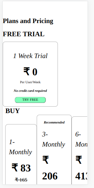
We designed our plans and pricing in a systematic manner, So the customer is able to distinguish the free, paid and recommended plans in one shot.
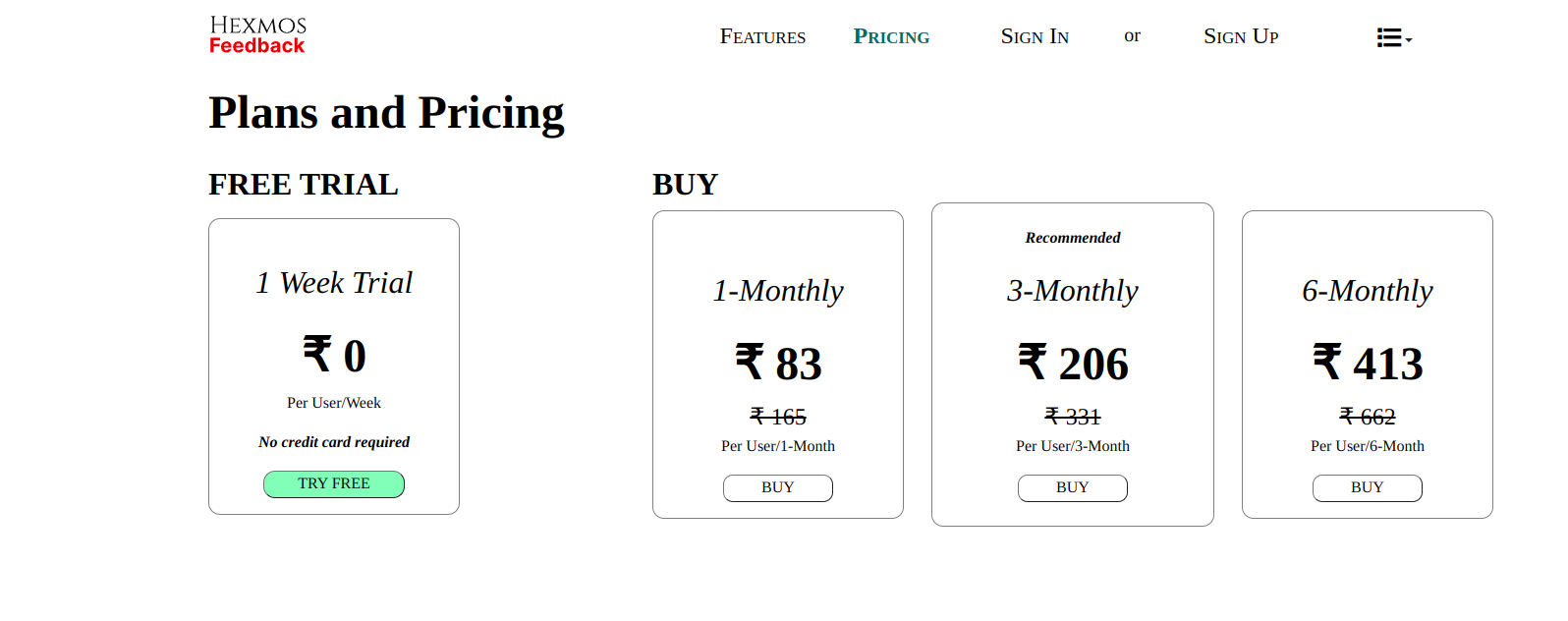
The current grid system is not compatible with mobile screens. All the paid plans are aligned in a row and some details are hidden.
The Bootstrap grid system, which relies on a combination of columns and rows, presents an excellent approach to constructing flexbox-powered grid layouts.
We used a series of containers, rows and columns to build the grid layout for the pricing page.
Container
<div className="container p-0" id="main-container">
Containers provide a means to centre and horizontally pad our site’s contents. They come in different types: container, container-fluid, and more.
Flex-Columns
Column classes indicate the number of columns we use out of the possible 12 per row. So, if we want three equal-width columns across, we can use .col-4. col-md will align the flexbox properly on smaller screens
<div className="col-md ms-0 p-md-0">
<h2 className="row m-auto p-auto text-center text-md-start" style={styles.mediumText}>
FREE TRIAL
</h2>
Flex-Rows
Rows are wrappers for columns. Aligning the items in a row inside the main column
<div className="col-lg-8 m-auto p-auto">
 <h2 className="row m-auto p-auto" style={styles.mediumText}>
     BUY
 </h2>
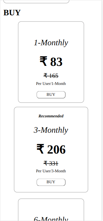
The pricing page after changes
Browser Compatibility
The main tool we will be using to solve this issue is a reset.css file
Reset.css file
We will create a reset.css file. This will apply some CSS properties that make the UI layout consistent for all browsers. This will help us in debugging browser compatibility issues.
The reset.css used here is of the following form, but you can modify it in the way you like
More information about why CSS reset is used here
* {
  margin: 0;
  padding: 0;
  box-sizing: border-box;
}

body {
  font-family: N, sans-serif;
}

body {
  height: 100%;
}

.container {
  max-width: 100%;
  padding: 1rem;
  margin: 0 auto;
}

h1,
h2,
h3,
p,
a {
  color: black;
  font-family: sans-serif;
}

.btn {
  background-color: #5e213d;
  border: none;
  color: white;
  font-weight: bold;
  width: 14em;
  height: 3em;
  font-variant: small-caps;
  cursor: pointer;
}

img {
  max-width: 100%;
  height: auto;
}

#main-container {
  background-color: #f0f0f0;
}
Let's observe how to solve these problems via 2 examples
Font Problem
Consider this problem, There is inconsistency with the fonts, which causes overlaps
In Chrome
In Firefox
To debug this problem reset.css is included in the page
The reset.css file makes the product text look consistent on both browsers
In chrome
In firefox
With the Arial font, there are no overlapping issues in Firefox
So, we can conclude that the root cause points to the font in use, as it's a different font.
The original font used is Georgia
style="font-family: Georgia; position: relative; overflow-y: scroll"
So we have found the root cause. Georgia font is not supported in Firefox browsers, So it will shift to a serif font by default. Since it's a different font it can mess up the layout if there are size differences.
So as a solution, we can do any of the following
- Priority-based font family of similar appearance
- We can add the Georgia font files within the project to support it
In this example, we will be implementing the first solution
style="font-family: Georgia, 'Times New Roman', Times, serif;
Here the fonts are ordered by priority, for example, if Georgia is not available, the font used will be Times New Roman
So, in both browsers, the text does not overlap, thus resolving the issue.
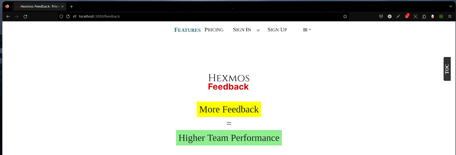
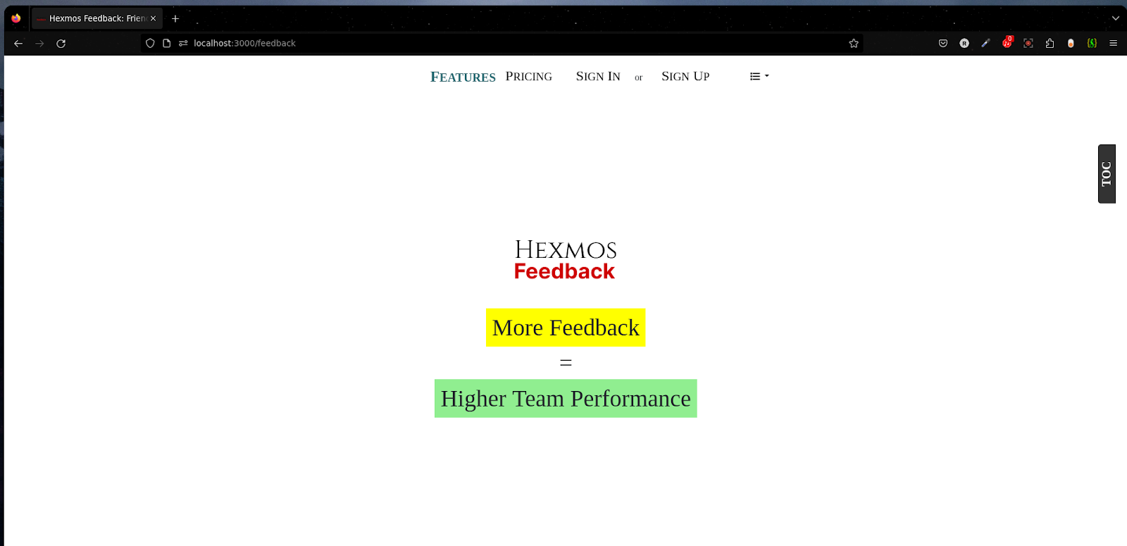
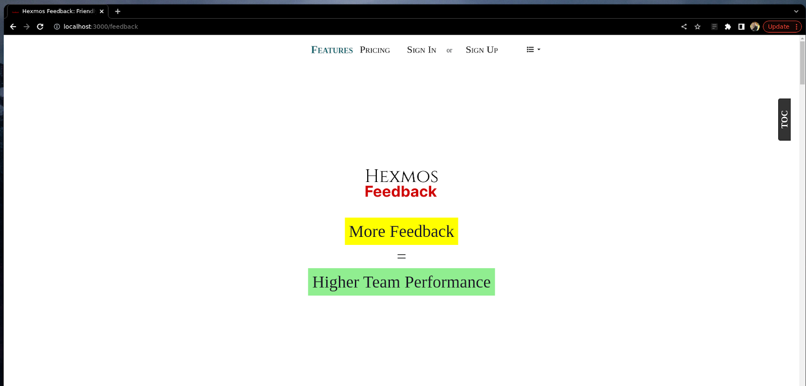
Spacing Problem
Our product landing page in Google Chrome
Our product landing page in the Firefox browser
Consider this problem, In the Firefox browser the spacing has become disrupted and the topbar is hiding the Hexmos feedback logo.
Using reset.css, when i have the following property
.container {
 	padding: 10rem;
}
There is spacing now, So we have a hint that the issue might be with the container
Looking into the div with container class we find the following,
 <div class="container js-toc-content" style="max-width: 970px;">
   <div class="row" style="min-height: 100%; padding-top: 0%; padding-bottom: 10%">
Here when I remove min-height: 100%; I am able to reproduce the Firefox issue in Chrome
When looking into the min-height property. It’s discovered that
in Firefox, using minimum height with percentages behaves a bit differently.
If the parent div's heights are not defined, then the percentage is assumed as 0, causing the problem we have.
To solve this issue we will use 100vh instead of min-height: 100%, this will use 100% of the viewport height
So the code will look like
<div class="row" style="min-height: 100vh; padding-top: 0%; padding-bottom: 10%">
In Firefox
In Chrome
Thus, we have solved the problem.
Conclusion
The 5 Critical Concepts we discussed helped us overcome major problems in Responsiveness and browser compatibility. However, there are still ongoing challenges that we are working to resolve in each iteration. Responsive design and browser compatibility cover a wide range, and new screen sizes and browsers can lead to issues in the future. For comprehensive testing and analysis, methods like cross-browser testing are available. Cross-browser testing involves ensuring that a website functions properly across different browsers and devices. Cross-browser testing involves 4 phases :
Initial planning > Development > Testing/discovery > Fixes/iteration.
Steps 2–4 will tend to be repeated as many times as necessary to get all of the implementation done. You can explore Cross-browser testing tools such as BrowserStack, CrossBrowserTesting, Sauce Labs etc. These tools simulate the different browsers and devices, allowing us to identify and fix any compatibility issues.

Hacker News Post