Try These Proven Techniques for Improving Your Webpage Speed
Learn how we boosted FreeDevTools' PageSpeed Insights score to a near-perfect 95. From optimizing TTFB to implementing critical CSS, we'll cover the key strategies that transformed our site's performance.


The speed and reliability of your webpage are critical factors for both search engine rankings and user impressions. When a site loads quickly, it doesn't just provide a better user experience—it gains a competitive edge in organic search visibility.
Research indicates that even a two-second delay in page rendering can result in a 4% loss in revenue per visitor. Performance isn't just a technical metric; it is a core driver of conversion rates and traffic retention.
LCP and CLS are two of the most important metrics for measuring page speed performance.
-
Largest Contentful Paint (LCP): Measures loading performance by tracking how quickly the largest visible element (usually a hero image or heading) renders.
-
Cumulative Layout Shift (CLS): Measures visual stability by quantifying how often elements "jump" around unexpectedly during the loading process.
In this article, I will walk you through the specific techniques and methods I used to optimize these metrics for FreeDevTools - A curated collection of 350K+ developer resources. By implementing these strategies, we successfully boosted our PageSpeed Insights score from an average of ~75 to a near-perfect 95.
A number of tools are available for testing page speed performance, but in this article, we focus on how to improve these metrics using Google's PageSpeed Insights and the Chrome DevTools Performance report.
How faster the main content loads
Largest Contentful Paint (LCP) is an important, stable Core Web Vital metric for measuring perceived load speed because it marks the point in the page load timeline when the page's main content has likely loaded—a fast LCP helps reassure the user that the page is useful.
How to measure the LCP
I recommend measuring the LCP value using the Chrome DevTools Performance tab. It is the most effective method because it provides a detailed breakdown of the loading timeline, showing exactly when the main content appears and pinpointing the root cause of any delays.
In this image below you can see the LCP for this page is 0.27s. A good score for LCP is 2.5s or less. LCP can be breakdown into two parts

- Time to first byte
- Element render delay
For this webpage the TTFB is 37ms and the element render delay is 232ms which contributes to total of ~0.27s LCP.
How to Optimize TTFB

Time to First Byte (TTFB) is the time the browser waits to receive the first piece of data from the server. If your server is slow to respond, your total page speed will suffer regardless of other optimizations.
To lower TTFB, check these common bottlenecks:
-
Database queries: One of th main reason for improving the Response per second of our product freedevtool is creating index for database queries. If you are fetching the same large content every time from database without any index it will take more time to fetch the content.
-
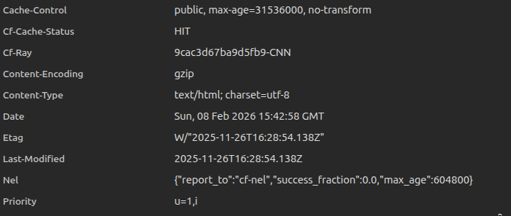
Edge server cache: If you use a CDN like Cloudflare, a "cache miss" forces the request to travel all the way back to your origin server, adding significant delay. To avoid this, properly configure Cache-Control headers and cache age (TTL) to ensure the CDN serves content from the edge instead of hitting your server repeatedly.
-
Multiple redirects: Avoid chaining URLs (e.g., http://site.com -> https://site.com -> https://www.site.com).

Use 103 Early Hints for render-critical resources
The 103 Early Hints header lets the server send a quick response while it is still busy generating the final HTML. This tells the browser to start downloading critical resources like CSS and fonts immediately, saving time that would otherwise be wasted waiting for the server to finish.

For example instead of waiting 200ms for the HTML to be ready, the browser receives a "hint" at 25ms to start downloading your main stylesheet.
Why the Browser Waits to Paint (Render Delay)
Even after your content is downloaded, the browser may delay "painting" it on the screen. This usually happens for two reasons:

- Render-blocking CSS: The browser won't show anything until it finishes parsing your stylesheets. If your CSS files are massive, the screen stays blank.
- Busy main thread: If heavy JavaScript is running during page load, it can block the browser from processing the actual render.
The Golden Rule: To avoid this, ensure your critical CSS is as lean as possible—ideally smaller than the LCP element itself.
For example if your hero image is 50KB but your CSS file is 200KB, the image will wait for the entire 200KB stylesheet to load before it can finally appear.
Improving Visual Stability
Cumulative Layout Shift (CLS) measures how much your page elements "jump" around while loading. Unexpected shifts disrupt users—causing them to lose their place while reading or, worse, click the wrong button by mistake.

In the image above, a card element shifts from the side to the bottom, resulting in a CLS score of 0.16. This score is determined by two main factors.
How is CLS Calculated?
The layout shift score is the product of two measures: Impact Fraction and Distance Fraction.
Layout Shift Score = Impact Fraction * Distance Fraction
- Impact Fraction: Measures how much space the unstable element occupies in the viewport between two frames.
- Distance Fraction: Measures the greatest distance the element moved relative to the viewport.

If an element occupies 50% of the screen and moves down by 25% of the screen height, the resulting shift score would be 0.125 (0.50 * 0.25).
Animations and Transitions
Smooth animations and transitions are great for updating content without surprising the user. While abrupt shifts create a poor experience, content that moves gradually helps the user understand state changes and keeps the interface feeling "alive."
A major cause of layout shifts is media loading without defined dimensions.
Reserve Space for Late-Loading Content
You can prevent layout shifts by reserving the necessary space for elements that load later—such as images, ads, or third-party widgets—directly in your initial layout.
- Min-Height: Setting a min-height on a container to ensure it doesn't collapse while empty.
- Aspect Ratio: Using the aspect-ratio CSS property to maintain correct proportions for responsive content.

In the image above, the red box indicates the pre-allocated space for an ad. By reserving this area upfront, the content below it stays in its original position when the ad finally loads, preventing a layout shift.
Back/Forward Cache (bfcache)
Ensuring your pages are eligible for the Back/Forward Cache (bfcache) is another highly effective way to keep CLS low.
The bfcache stores the fully rendered state of a page in the browser's memory. When a user navigates back or forward, the page is restored instantly exactly as they left it—eliminating any loading-related layout shifts.
Check out this video to learn more about how bfcache works: Understanding bfcache
The Mandatory Styles
As mentioned in the sections on LCP and CLS, Critical CSS is the minimal set of styles required to render the "above-the-fold" content (everything a user sees immediately without scrolling).
Since browsers won't render a page until they've downloaded and parsed all CSS, large stylesheets can significantly delay the initial paint. By inlining critical styles directly into the of your HTML, you eliminate an extra network request and allow the user to see the page content almost instantly. The rest of your CSS can then be loaded asynchronously in the background.
How to Generate Critical CSS?
Manually identifying above-the-fold styles is nearly impossible for complex sites. Instead, you can use the critical npm package to automate this process. It extracts the necessary CSS for a specific viewport and inlines it directly into your HTML.
const critical = require('critical');

critical.generate({
  base: 'dist/',
  src: 'index.html',
  dest: 'index.html',
  inline: true,
  dimensions: [
    {
      width: 1300,
      height: 900,
    },
    {
      width: 500,
      height: 900,
    },
  ],
});
Make sure to include both dimension for smaller and larger screens while generating critical css.
Best practices for Critical CSS
-
Use Sparingly: If you inline too much CSS, you lose the benefits of browser caching. Only inline what is absolutely necessary for the initial view.
-
Load the Rest Asynchronously: Use rel="preload" to fetch the main stylesheet in the background. This ensures the rest of the site's styles are ready as soon as the user starts scrolling.
<link rel="preload" href="styles.css" as="style" onload="this.onload=null;this.rel='stylesheet'">
<noscript><link rel="stylesheet" href="styles.css"></noscript>
- Don't Forget Dark Mode: If your site supports dark mode, make sure your critical CSS includes the essential styles for both themes.
Conclusion
Optimizing for Core Web Vitals is not a one-time task; it is a continuous process of monitoring and refinement. To stay ahead, we implemented an automation system using the PageSpeed Insights API to consistently track performance across all key pages of FreeDevTools. These improvements don't just result in better scores—they create a faster, more reliable experience that keeps users engaged.